The Guaranteed Quality Checklist provides real-time updates on client preferences and quality assurance checks. It allows teams to track adjustments, to ensure compliance with client specifications. Designers are required to reference each item on this list before submitting to team or QA. Failure to address preferences noted in this checklist can result in an error tag.
Logos
Learn Sirtex logo should always link to the regional home page
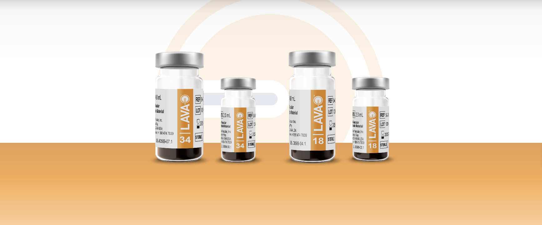
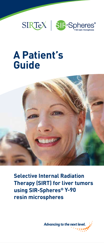
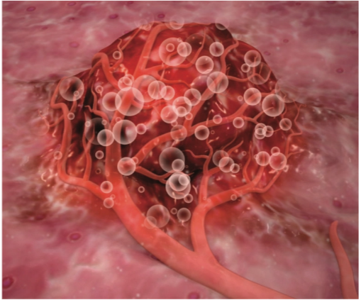
They prefer using real life images or computer generated images of the body (mostly the liver) and internal processes to explain their product better.
Stock photos should be friendly, bright, medical, and have diversity for people.
Audience Sirtex is a pharmaceutical company that writes for medical providers and patients who might be receiving their medicines and techniques. Their efforts are primarily focused on the treatment of liver cancer using specialized technology called SIR-Spheres.
Character In their copy, Sirtex is corporate, progressive, modern, serious, bold, and professional. They’re a medical company, so what they’re discussing is a serious matter. They don’t want to devalue their messaging by adding a lot of levity or flowery language. Their copy is matter-of-fact and dry, but they display more humanity using images like stock photos, and they’re more human in their “about us” section.
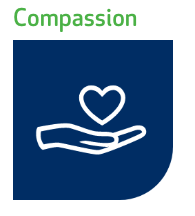
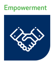
Emotion When you read their copy, Sirtex wants you to feel productive, confident, informed, empowered, and relieved. As a medical company, they are there to assure patients that their techniques and technologies are effective, explain how they work, and convince physicians to implement their products into patient treatment. They do this by being clear about how everything works, and showing their value.
Tone In their copy, Sirtex is direct, data-driven, serious, confident, empathetic, authoritative, professional, and helpful. They speak like doctors do, which is exactly what they need to do to be successful. This should be maintained throughout whatever copy you write for them. Remember that doctors also need good bedside manner, though. Clinical doesn’t mean harsh.
Language Sirtex speaks from a team perspective (using “we” instead of “I”), they speak in US English, and they use industry-specific terminology (but they make sure it’s relatively easily understood). They don’t use humor, pop culture references, or emojis. They sometimes use hashtags, but rarely. Usually only for upcoming events.
Purpose
The purpose of Sirtex’s copy is to educate, inspire confidence, and sell.
Brand Differentiator
Sirtex sets itself apart by maintaining a balance between clinical authority and human connection, emphasizing education and clarity, fostering an emotional connection through empowerment, maintaining professionalism, and having a focused purpose in their communication strategy.
They offer a real and viable solution for patients and focus on getting this treatment out to the world to help people.
These factors collectively contribute to their distinct positioning within the pharmaceutical industry.