UX/UI Designer Training Module

sections

What is User Experience?

UX stands for “user experience.” A user’s experience of the product is determined by how they interact with it. Is the experience smooth and intuitive or clunky and confusing? Does interacting with the product give people the sense that they’re efficiently accomplishing the tasks they set out to achieve or does it feel like a struggle? User experience is determined by how easy or difficult it is to interact with the user interface elements that the UI designers have created.

What is User Interface?

UI design stands for “user interface.” The user interface is the graphical layout of an application. It consists of the buttons users click on, the text they read, the images, sliders, text entry fields, and all the rest of the items the user interacts with. This includes screen layout, transitions, interface animations and every single micro-interaction. Any sort of visual element, interaction, or animation must all be designed.

Usability Heuristics

The progress bar up on top is indicating 3 out of 5 images are uploaded. The user is made aware of the progress and can wait until the process is completed.

1

Visibility of System Status

The design should always keep users informed about what is going on, through appropriate feedback within a reasonable amount of time.
Users can relate these graphics with a real payment card and can fill in details without hesitation.

2

Match Between the System and the Real World

The design should speak the users’ language. Use words, phrases, and concepts familiar to the user, rather than internal jargon. Follow real-world conventions, making information appear in a natural and logical order.

This is a portion of a UI guideline for a product. By using official brand guidelines, we can make our designs/products easier to use.

3

Consistency and Standards

We should follow consistency and standards throughout product design. Consistency is not only for colors and button styles, but it is also for the overall experience. Don’t let the users be confused by adding different kind of experiences on different task flows.

4

Recognition Rather Than Recall

Minimize the user’s memory load by making elements, actions, and options visible. The user should not have to remember information from one part of the interface to another. Information required to use the design (e.g. field labels or menu items) should be visible or easily retrievable when needed.

Users can see recently viewed items on the home screen. This reduces their cognitive load and makes them more likely to purchase an item.

The “Learn more” button avoids noise by reducing additional information for that block not necessary to showcase on the home page.

5

Aesthetic and Minimalist Design

Interfaces should not contain information which is irrelevant or rarely needed. Every extra unit of information in an interface competes with the relevant units of information and diminishes their relative visibility.

Navigation Design Best Practices

What Is Navigation Design?

  • Navigation design is the discipline of creating, analyzing and implementing ways for users to navigate through a website or app.
  • Navigation plays an integral role in how users interact with and use your products. It is how your user can get from point A to point B and even point C in the least frustrating way possible.

Good Navigation Design Can:

  • Enhance a user’s understanding
  • Give them confidence using your product
  • Provide credibility to a product

Rules for a Successful Web Navigation

1

Create and Maintain Clarity

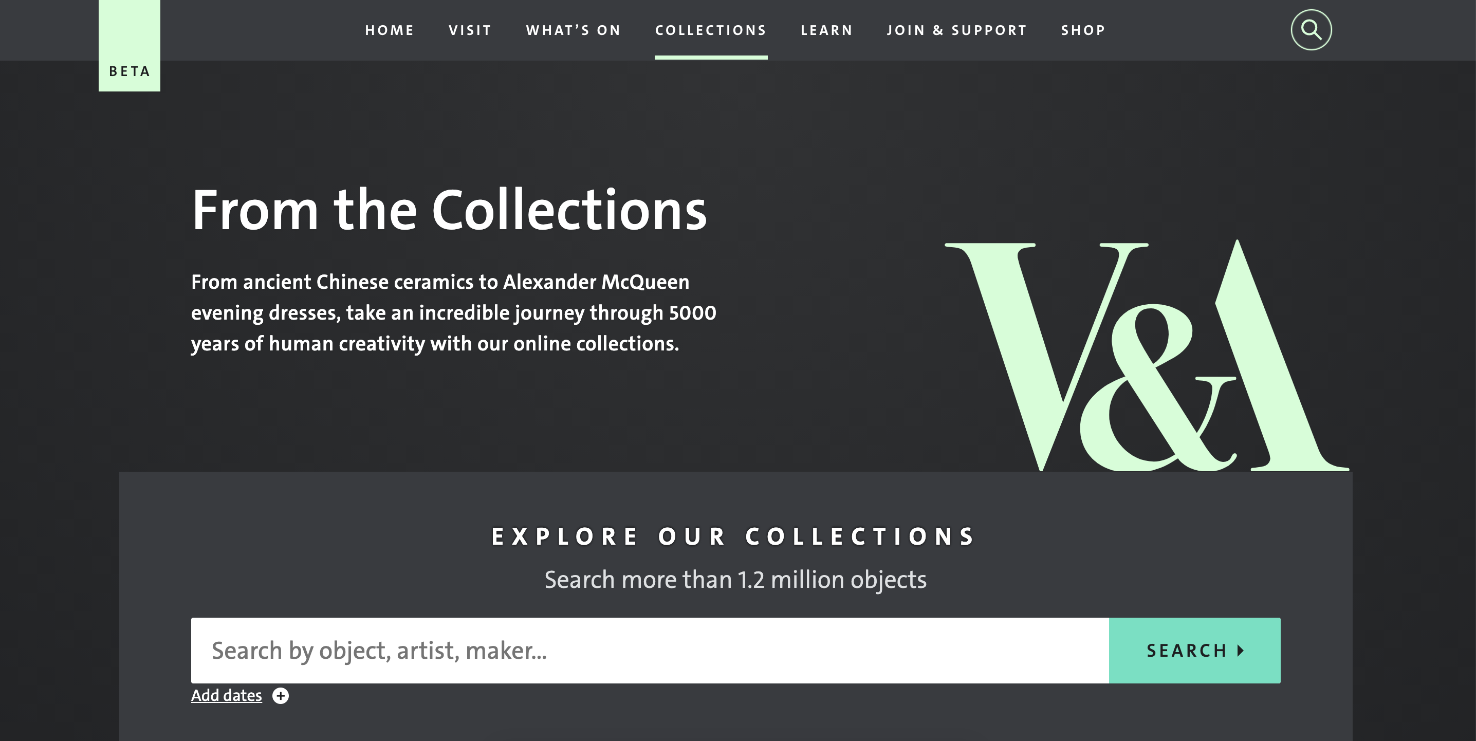
Navigation should be clearly labeled and signposted so that users understand where they are and where they can go to. If you want users to be able to access a landing page dedicated to Collections, then labeling that landing page “Collections” in the navigation bar makes it clear to the user what they can expect from clicking that link.

2

Use Meaningful Labels, Not Formats

Your navigation is an opportunity to provide more relevant information to your users. If you navigate to a website that sells watches and their navigation menu has ‘products’ written in it, is that telling you anything? Not really. People don’t tend to search for ‘products’. It’s a broad, catch-all term. Be specific as possible, as shown here with the different types of watches available. 

3

Align Navigation Design With User Goals

How do you identify the needs of your users? You ask questions. Questions, like the ones James Kalbach outlines in Designing Web Navigation: 

By identifying the needs of your users, you’ll be able to create a navigation that helps them. Here is an example of a breadcrumb navigation helping users backtrack to less specific items.

Essential Design Tips for Creating Great Web Navigation

Do

  • Put navigation in places where users expect to see it
  • Visually separate navigation from content
  • Write descriptive labels
  • Mind the order 
  • Add search to simplify web navigation
  • Test your website navigation design on mobile
  • Analyze how people use your navigation system
  • Limit the number of top-level options to seven

Don't

  • Avoid styling navigation options as buttons
  • Don’t use buttons for navigation
  • Avoid drop-down menus
  • Don’t optimize web navigation design only for the homepage

What is UX Writing?

  • UX writing creates texts that support and enhance users’ communication with interfaces, let them clearly understand what’s going on, and lighten the negative experience in case of errors or problems of interaction.What is crucial to keep in mind is that
    • Text is a part of the design
    • Text is a part of the user experience.

Useful Tips on UX Writing

1

Be Concise

To facilitate navigation and discovery, write UI text in short, scannable segments that focus on a limited number of concepts at a time.

2

Write Simply and Directly

Use simple, direct language that makes content easy to understand.

3

Address Users Clearly

Address users in either the second person (you or your) or the first person (I, me, or my), depending on which is suitable and clearest…

4

Avoid Combing First & Second Person

Users should not have to wonder whether different words, situations, or actions mean the same thing. 

5

Communicate Essential Details

Communicate only essential details so users can focus on their own tasks. Sometimes the most effective UI contains no text at all.

6

Write for All Reading Levels

Use common words that are clearly and easily understandable across all reading levels. Turn on Location History Enable Location History

7

Avoid Industry Terms and Feature Names

Avoid industry-specific terminology or names invented for UI features.

8

Write in the Present Tense

Use the present tense to describe product behavior. Avoid using the future tense to describe the way a product always acts. When you need to write in the past or future tenses, use simple verb forms.

9

Use Numerals

Use numerals ( “1, 2, 3,” not “one, two, three”) unless writing copy that mixes uses of numbers, such as “Enter two 3s.”

10

Avoid Using Periods on Solitary Sentences Like:

  • Labels
  • Hover text
  • Bulleted lists
  • Dialog body text

Examples:

Don't

Do

Don't

Do

UX / UI Font Rules of Thumb

  • Typography exists to honor content, not distract from it. 
  • A good rule of thumb is no more than 3 fonts to a design. 
  • Even when only dealing with a single font if you have too many variable weights, styles, and sizes it can still appear unstructured or unprofessional, although this is not as high a priority as having multiple fonts. 
  • Limit line length to about 60 characters when creating bodies of text. The Baymard institute suggests this number for optimal readability. Text boxes fewer than 40 characters wide feel disjointed and stiff, around 80+ and the reader has a hard time finding the next line when their eyes scan back to the left. 
  • Limit ALL CAPS usage to headings and titles. All caps in a title are eye-catching, in a sentence, it slows readers’ ability to scan quickly for information.
  • Don’t minimize spacing in line height, with very few exceptions this leads to less readability.
  • Remember the 60/30/10 rule. To bring balance the main color should be about 60% of the design, secondary color about 30, and accents or CTA colors about 10. If you are working with 1-2 colors you can use white space and images in place of a third color and can apply this to any of the ratios.
  • Color is useful in drawing the eye, highlighting, or minimizing certain areas.
  • Avoid using red or green colors by themselves to identify important items and text as users may have color blindness.
  • Small text should have a contrast ratio of 4.5:1, large font (14pt bold, or 18pt regular generally) should have a contrast ratio of 3:1. Coolers.co has a great contrast checker that rates text color contrast as well as giving individual ratings for those colors in large or small text format.
  •  Use color psychology, nature, and art for inspiration.

CTA Buttons - Types

  • Your primary CTA should always have your clients chosen CTA color.
  • “Ghost buttons” are great supporting secondary buttons, you can create more user recall if you use the same CTA color on the outline and text of the secondary button.
  • Your primary CTA should be “above the fold” on web pages and immediately visible for emails.  
  • For longer emails and web pages, it’s a great idea to place a second, repeated, primary CTA at the end of your email or landing page so users don’t have to scroll back up.

Consistency is Key

Consistency in UX/UI is ensuring that the visual elements and interactions of the design are the same across all platforms. This creates a lower cognitive load for users, and a better, more intuitive experience.
  • Heading, subheading, CTAs, and body copy should have not only consistent font, but consistent sizing, color.
  • Color palettes should be implemented consistently across the site.
  • Cards, pictures, buttons, border-radius should always match. If the buttons on your webpage are rounded, they should also be rounded in emails etc.

Tips for Creating Hierarchy

1

Size

Larger objects will draw a user’s eye, in text-heavy formats, this can include a block of text or background color in a text area.

2

Color

The strongest colors always draw a user’s eye. Bright colors will always stand out more than muted tones. You can easily prioritize and de-prioritize similar areas using color only. While still honoring the client’s color palette this can be done with hue, saturation, brightness, or opacity.

3

Proximity

Human sight naturally organizes, groups, and finds patterns. We can use this to differentiate important items and show relationships between text, images, CTAs.

4

Alignment

Any element with a differing alignment from other elements will stick out. You can play with this to draw the eye as breaking alignment and expected patterns will always make users look to that area.

5

Repetition

Great when used in conjunction with Alignment and Proximity, Repetition is useful for creating patterns and easy fast user recall. Human eyes love to find patterns.

6

Negative Space

Negative space is crucial for allowing the user to find patterns and recognize hierarchy. If elements are crammed together the user gets overloaded with information and easily confused or frustrated. Generally speaking the MORE negative space an element has, the more important it seems.

7

Texture

Complex textures always attract more attention than flat ones but texture should be used in careful measure. Too much texture can be overwhelming.