
Welcome to SalesLabX! We’re thrilled to have you be part of our growing team. This training manual will give you an overview of what it means to be a Developer at SLX, provide essentials steps for your onboarding process, as well as serve as a reference you can use throughout your time with us.
You might be wondering just what the heck our company does exactly. For the most part, we exist because Pardot and Salesforce are very prevalent tools in the B2B marketing space, but they are quite complicated for the average user. We happen to specialize in marketing using these platforms! Pardot and Salesforce are extremely powerful sales and marketing tools that allow companies to manage and nurture prospective and existing customers and to apply automated targeted marketing strategies to those contacts. There are almost limitless ways to use this software to increase a company’s audience reach and sales, but the tool isn’t always very user-friendly or stylish. Many companies get locked into a contract with Pardot/SF and their marketing teams lack the technical knowledge to take full advantage of the tool.
This is where SLX comes in. We provide Pardot and Salesforce strategy consulting and execution, as well as access to talented coders and designers that can make communications from Pardot and Salesforce look exponentially more professional and sleek than what a typical marketing employee using the interface could do on their own. There are other companies in the market that offer similar services, but typically they are very expensive, have long turnaround times, and involve lots of scope creep and friction. Our advantage comes from the fact that we offer unlimited access to these resources on a subscription based model to eliminate friction and scope creep. We bring companies’ marketing goals and ideas to fruition in what feels like a magically convenient way. The goal is to make them feel like our product (the SLX subscription) is custom-built for them by integrating seamlessly into their strategy and workflow so well that they can’t imagine doing it without us.
As a Developer you have the responsibility of taking all the lovely designs from the design team and making them fully functional web assets!
Here’s a summary of your role:
Your Department Lead is Stephanie Crane, Creative Director, stephanie.crane@saleslabx.com
Your Team Lead is Eliav Nachmani, Developer Team Lead, eliav.nachmani@saleslabx.com
Check out our organization chart on Gusto to see everyone at SLX!
How to View our SLX Org Chart:
Feedback for Leadership: Feel free to use Suggestion Ox Anonymous Suggestion Box or request a chat with leadership any time. You will also have monthly one on one meetings with your team lead to check in and discuss your progress, go over suggestions/requests you may have, etc.
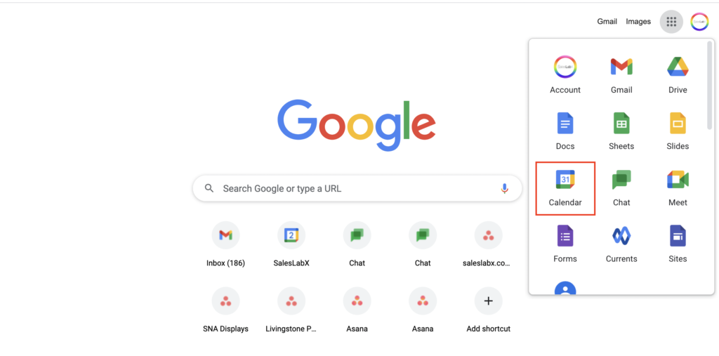
Here at SLX, we use Google Suite as our main communication and organization platform. The first step is to set up your Gmail account settings:
Enable Screen Sharing and Recording
Recommended Bookmarked Sites:
Recommended Chrome Plugins:
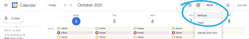
At SLX, we use Google calendar to display all team huddles, internal events (such as Happy Hours, Learning Labs, etc), and sessions with fellow teammates. Access your calendar here or by opening your browser window and clicking on Google Calendar (see screenshot below).
How to View Other Team Members’ Calendars:
How to Schedule Internal Meetings with Team Members:
Sharing Your Calendar with HR and Your Team Lead:
In case of an emergency time off, our HR (People Ops) team or your team lead will need access to your calendar to set your Out of Office notice and inform your clients. Please share your calendar with hr@saleslabx.com and your team lead. Here’s how to do so:
Calendar Best Practices
When you take time off, you’ll be asked to create an “Out of Office” Event in Google Calendar. Here’s a quick video showing how to do that. For more info about our PTO policy, please visit the SLX Perks & Policies page.
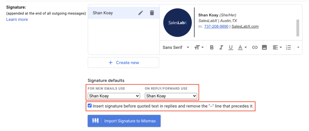
Setting Up Your Email Signature
Email Best Practices
File Management:
We use Google Drive as our main file storage and sharing system.
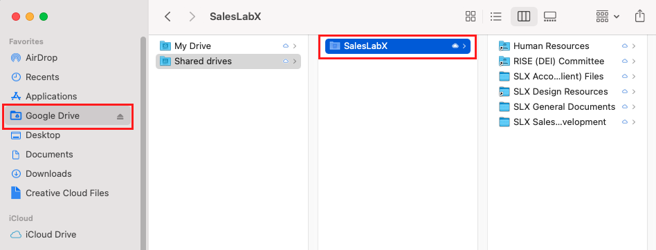
Please keep all project files in our shared Google drive: SLX Design Resources
To use the Shared Google Drive you’ll need to be invited to SLX’s team. If you are unable to access it, please ask your trainer to invite you. Once you have access to the shared drive, you will need to download the Google Drive sync for desktop:
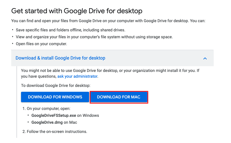
If Drive is installed correctly, you’ll be able to see ‘Google Drive’ on your left navigation panel when you open up your Finder window (see screenshot below).
Sharing Files Internally

File Naming Conventions & Folder Structure in GDrive
GDRIVE: SLX Design Resources File Structure


At SLX, Google Chats is used for 1:1 and group communication! While you can access Gchat from your Gmail inbox, we recommend downloading the desktop app for a better user experience. Communication here at SLX is very open as we work collaboratively with all other teams on a daily basis. Use Google Chat to message teammates to connect about tasks, ask questions, hop on a quick call, or get to know one another!
Follow these instructions to download the desktop app.
Inviting Someone to Chat
Inviting Someone to Connect Via Google Hangouts
Sometimes, it’s faster to hop on a quick call to discuss a task or get a question answered. Within your chat box, you have the option of sending a Google Hangouts (video) link. Click on the camera icon as shown below.

A Google Hangouts link will auto generate as shown below. Press enter to send the link to your teammate. Hop in the link to chat with them!

Groups
Upon joining the team, you’ll be added to the following internal chat groups:
You will also be added to your respective team huddle group and a few others along the way.
Chat Notifications and Settings
Click on the wheel icon on the top right of your app to manage chat settings. Learn more about Google Chat Notifications here.
Google Chat Best Practices
NordPass is our password manager tool and is used to store login information for internal platforms and clients’ accounts. You’ll be invited to join NordPass on your first day. Click below to read our NordPass Guide, including how to set up your account and use the tool. Do not move onto Step 7 until you have completed all the steps in the NordPass Guide.
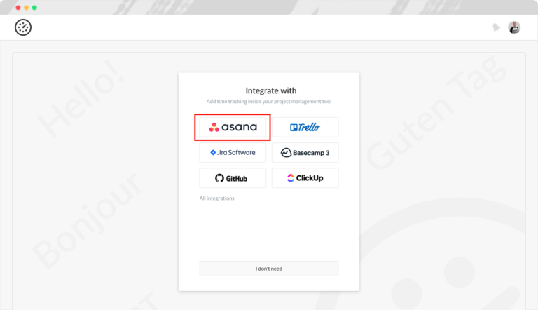
Asana is our main project management tool, used to organize, track, and manage tasks. You’ll be working in Asana on a daily basis. If you’re not familiar with the basics of Asana, please begin by reviewing the below guides and tutorial videos:
We have both internal and client-facing Asana boards for each account. The internal boards are what the Design, Salesforce, Development, and Pardot teams see. The client-facing boards are what the clients see. Only Account Coordinators have access to manage both boards.
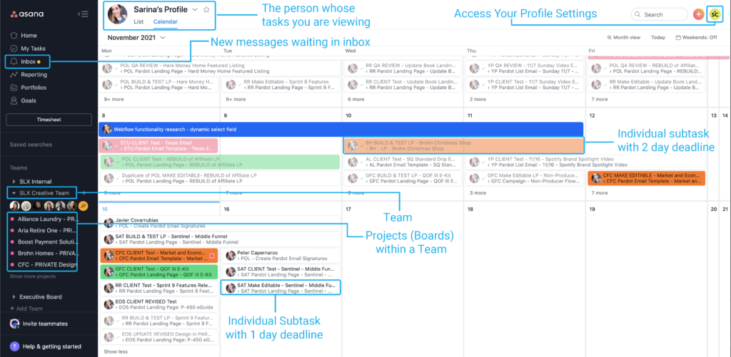
Teams, projects, and tasks are the key to our workflow in Asana. Here’s how they look using the Calendar view.
Learn more about Asana’s calendar view here.
Asana Teams
At SLX, we use Teams a little differently. Teams are used to organize a set of projects (boards). You will be added to the relevant teams during your on-boarding process and can access them through your left navigation bar under ‘Teams’.

Asana Projects (also known as Boards)
Projects are created under teams. A team can have multiple projects. Each client account has their own project, also referred to as boards. We have internal boards and external boards. Internal boards are accessed by our internal teams. And external boards are accessed by our clients. As an AC, you will work daily in boards to manage tasks, set deadlines, communicate with clients, and collaborate with other internal team members.


Task Cards
Tasks are essentially our “tickets”. Clients request tasks and it is the job of the ACs to help clients to accomplish their requests by building out the task on the internal board in Asana, where it can then be assigned to you and your teammates.
Task Fields
Within task cards, the standard fields we use are:
In general, these fields are almost always updated by ACs and Team Leads, so you will not be responsible for configuring or updating them.
Mentions and Collaborators
Watch our video below to learn more about Mentions and Collaborators.
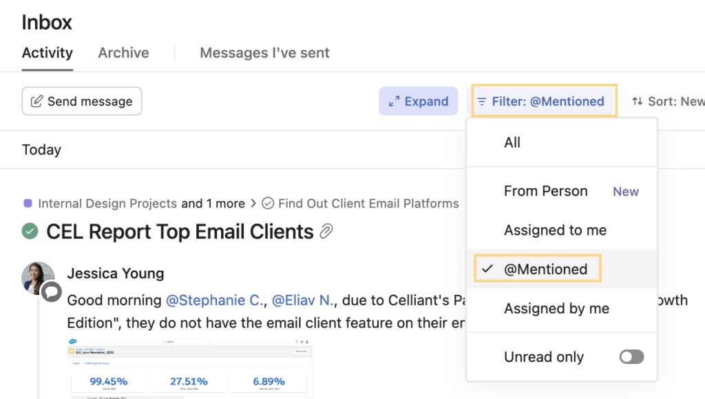
Asana Inbox
Your Inbox is where you will receive notifications about recent activity on tasks you are involved in. It’s important to check your Asana inbox regularly throughout the day so you don’t miss updates or approvals. To learn more about Asana Inbox watch the tutorial below and read this guide.
Questions/issues with a task in Asana?
Message your Team Lead + the appropriate AC in a group chat to keep them both in the loop. If a deadline extension is needed, please notify them by 2pm CDT at the latest. We recommend setting a reminder for yourself at 1:30pm to check in with your to-do list and make sure you are on track to finish everything that’s due by the end of the business day.
Not sure which AC is associated with which account(s)? Check the Collaborators listed at the bottom of the Asana card, or check out this handy dandy spreadsheet: SLX Account Ownership
Everhour is a time tracking tool that integrates with Asana. With Everhour, you can track how much time you spend on each task. We use Everhour to collect baseline data, including which parts of your role could be made more efficient, what types of tasks are the most time consuming, and which accounts are monopolizing your time. Our goal is to help you as an AC better balance your workload, expand your bandwidth, improve productivity, and better manage client expectations. Everhour helps us collect the data we need to make informed decisions.
How to Access Everhour and Integrate it with Asana


Everhour Tips & Best Practices
FigJam is a proofing tool used by our design team to provide design drafts and final proofs to clients. You may sometimes see FigJam links referenced in tasks as a way of sharing the approved design proof for a project. Figjam is a part of the Figma design tool.
How to Access Figma
You will find projects listed in the left column under the Team name “SLX Team.” The projects are in alphabetical order based on the client’s initials. See Figure 1.1.

Folders in Figma
You’ll notice each client has three project folders assigned to them: Design, Internal Proofing, and Client Proofing. See figure 1.2 below.
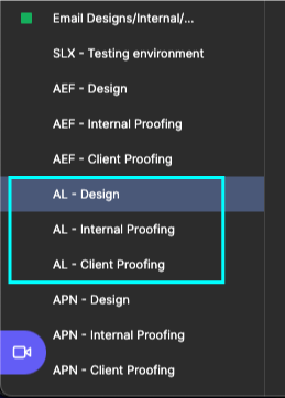
This means that for client work, there will be two versions of each project: the internal review project (look for “NPROOF” following the client’s initials in the file name- N stands for Internal), and the client facing project (look for “XPROOF” following the client’s initials in the file name- X stands for External).
The naming conventions for projects in Figma are as follows:
SLX DESIGN Project Name [DATE] – Email Design Project (Figma file)
SLX NPROOF Project Name [DATE] – Internal Proofing Project (Figjam file)
SLX XPROOF Project Name [DATE] – Client Proofing Folder (Figjam file)
You can access a shared Webflow account using our NordPass extension:

Here’s an example of a full LP build using an existing template:
Here is a tutorial/session explaining how to create a custom preference page:
Creating sliders and carousels in Webflow can be a real headache—limited flexibility, clunky UI, and constant workarounds. Instead, try using our Internal tool here: Carousel/Slider Builder. It’s a cleaner, faster way to generate responsive sliders or carousels without the Webflow pain. Here’s how it works:
Switch between “Slider” or “Carousel” mode using the toggle in the top-left.
Customize your layout — control the number of visible columns, total items, autoplay, and arrow positions.
Export and paste the generated HTML/CSS/Javascript directly into your exported HTML file from Webflow.
Then you can edit the carousel cards directly in the HTML.
It’s a massive time-saver and gives you way more control than Webflow’s native options.
Additional Topics:
Did you know that the average time spent reading an email is 10 seconds?
This is why it’s important to keep your email layout simple and scannable.
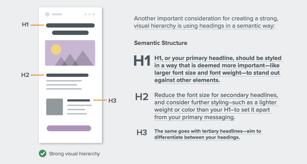
As with all graphic design projects, it’s important to create a clear hierarchy within your email layout. Hierarchy is when we intentionally create visual differences that reinforce different levels of importance—which helps readers consume content in email quickly.
Examples:
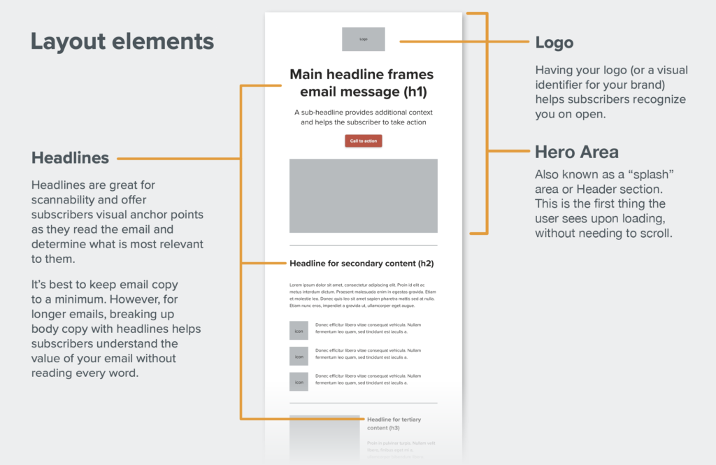
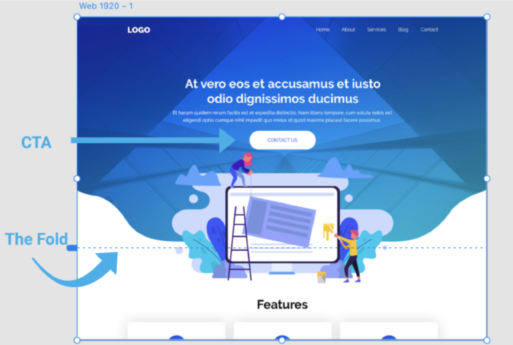
The hero area is what your subscriber sees on load. It’s your shot to get them to take action, so make it count! Use big and bold typography to make the purpose of the email clear. For those who are ready to convert, give them the opportunity to take action with a clear call to action (CTA), or grab their attention with engaging imagery

Compression: Part of a great subscriber experience is ensuring your emails load quickly. One of the factors that impacts load time is image file size. Including just one image with a large file size may drastically increase the time it takes for your email to load. That’s why ensuring images are compressed appropriately is key. Aim to keep the overall weight of imagery as low as possible. The combined weight of the imagery in one email shouldn’t exceed 2 MB.

Iconography: Icons are a great way to apply visual content to email. They can illustrate list items, create visual anchors, and support content hierarchy.
Functions of iconography:
One of the first aspects of design that people play with is typography–and it’s important in email design, too. But accessibility is also critical delivering a great subscriber experience. To deliver on both, avoid trapping your message in images, and use live text with web safe fonts and web fonts whenever possible.
One of the first aspects of design that people play with is typography–and it’s important in email design, too. But accessibility is also critical delivering a great subscriber experience. To deliver on both, avoid trapping your message in images, and use live text with web safe fonts and web fonts whenever possible.
For further reading, check out Litmus’ Ultimate Guide to Web Fonts.
Another important note about typography in emails is that sometimes clients will have a brand font designated in their brand profile that is neither web safe or a web font (not a google font). It’s possible to use custom fonts on a website or landing page by uploading and hosting a webfont file, such as a WOFF, OTF, or TTF, however– this does not work for emails. We always recommend a client use a Google font alternative to their custom brand font for emails.
Readability:
Calls-to-action (CTAs) help guide your subscriber to the primary action you want them to take. Generally speaking, each email you send should have a primary goal, and therefore at least one CTA.
Primary CTAs: Your primary CTA is the main action you want your subscriber to take. It should always be the most prominent in your email and styled in a way to help it stand out.
Secondary CTAs:
After primary CTAs, any further actions you want your subscriber to take are secondary CTAs. These should be styled in a less dominant way. You can still offer a button, but use a muted style—such as a color that isn’t as bold, or a white button with a color border. Or, you can simply offer a styled text link. For a styled text link to be effective, it should 1) be a different color from the copy and 2) bolded or underlined. This helps the reader recognize it as a clickable element.

Creating an Email in Figma
What is Figma?
Figma is a cloud-based collaborative web design application that can be used for emails, webpages, UI design, logos, and more. Here at SLX, we use Figma + a plugin called Emailify for building responsive emails and email signatures. Emailify is a plugin for Figma that lets you design and export responsive, production ready HTML emails from Figma without having to code manually. It allows us to build using commonly re-used drag and drop components, and we can also create our own custom components to add to our library as well.
Accessing Figma
When logging into Figma, sign in using credentials in NordPass, or login using Gmail and the design@saleslabx.com email address.
Note: This is a shared account for all team members. You do not need to change any settings.
On the side left panel within Figma, there is a section called “Teams”. Underneath “Teams”, on the SLX Team, there is a list of client folders that are named:
[Client] – Design – This is where we create email design files for each client, using Figma + the Emailify plugin.
[Client] – Internal Proofing – This is where we submit proofs as figjam files for internal (SLX) eyes only, before submitting proofs to clients.
[Client] – Client Proofing – This is where we submit proofs as figjam files for AC and client review, after the internal review process is complete.
Starting a New Email Project
To begin a new email design project, click on the appropriate client’s design folder underneath the section “SLX Team”. Naming convention for folder: [Client Initials] – Design.
Once you’ve clicked into the folder, you will see three button options: New design file, New FigJam file, and Import file. Choose the selection “New design file”

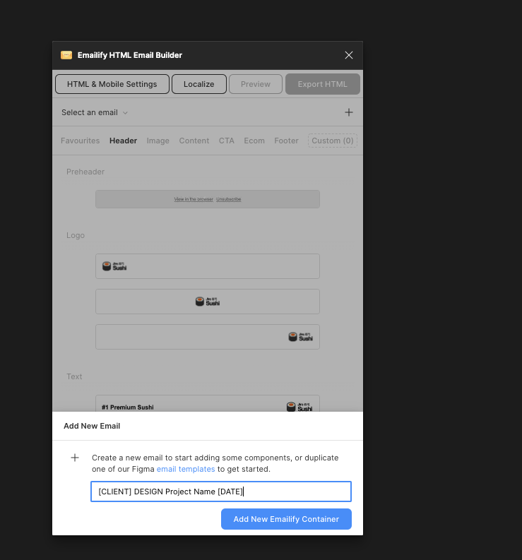
You will be taken to a Figma canvas. At the top of the canvas, you can rename the file using this naming convention: [CLIENT INITIALS] DESIGN Project Name [DATE]

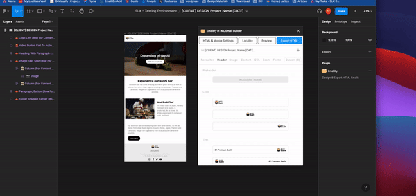
Open the Emailify Plugin
On the Figma canvas, we will be using the Figma plug in Emailify to design the email.
Before beginning your design, right-click anywhere on the Figma canvas to select the option “plugins” then “Emailify HTML Email Builder”.

Once clicked, the Emailfiy builder Panel will appear. Before you can use the builder, you will need to implement the name of the project. When naming the asset, you will continue to use the naming convention: [CLIENT INITIALS] DESIGN Project Name [DATE]
Once the name is updated, click “Add New Emailify Container”
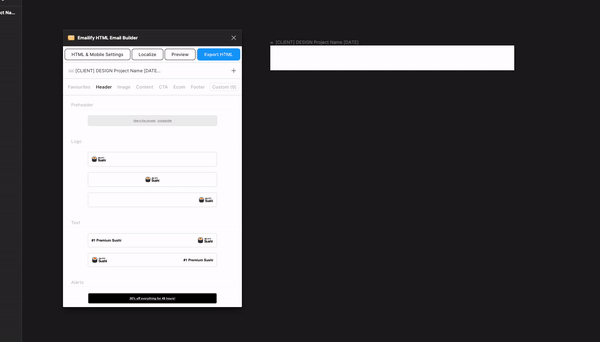
Once the option is clicked, a blank email container frame will appear on the canvas. This is where you will use the builder to build your email.

Using the Emailify Plug in
Emailify is an email builder plug-in for Figma that can be used to generate HTML code for responsive emails. Within the builder, you have many different customizable components to choose from to create your email design. We can also create our own custom components to add to our library as needed.
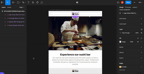
Adding Components
To add components within your container frame, you can click on the component thumbnail inside the Emailify builder panel to instantly add it to your container frame on the Figma canvas. This will be added as a native Figma component.
It’s important to always choose a base component as close as possible to what you want your finished layout to look like, so that you can keep editing of the structure of the component to a minimum, because editing the structure/layout outside of simple spacing adjustments makes it more likely the component will not function well for responsiveness during testing due to broken code.
Pro Tip: If you need a new module to get the layout you want, Dev can help with creating a new one, testing it, and optimizing the code for responsiveness. We should only use a custom coded module from dev as a last resort if we are absolutely sure we can’t make it happen using the existing Emailify modules. Once Dev has created a custom coded module, we will not be able to edit it easily using Figma- it can only be edited through code from the custom code block.
Editing the design and content of your components with Figma
When you add any component to your email, it’s placed within your Figma canvas, where you can edit the elements it contains.
For example, this means that for a text box, you can select it and update its content, change its font sizes, line-heights, letter spacing, paragraph spacing, and horizontal alignment using the regular Figma design settings panel on the right side of the screen. If you have used Adobe XD or Sketch, the Figma tools should look familiar.
Note: Make sure not to drag elements around too much within the component since this could break the frame the element lives in, but it is possible to safely copy and paste elements within the components.
Layers Panel
On the left-hand side of your screen, you find the layers panel.
Layers → every new element you add creates a new layer automatically.
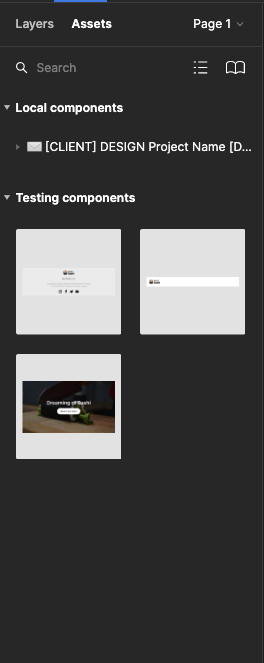
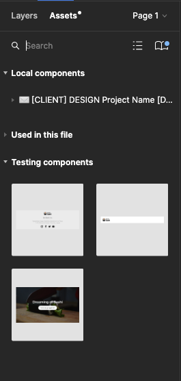
Assets → Your components are kept here, and you will also find your library button in this section (more about the library, components and instances will be explained later).
Design Panel
On the right-hand side of your screen, you find the design panel with features that you can use to design your email.
Here’s a comprehensive guide to the Figma Design Panel. We’ll highlight the most key features below:
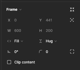
Frame → Here you can change size, rotation, and border radius of the selected element.
Auto layout → Can change the positioning and alignment of the elements within the selected component, and adjust padding within the frame or to the selected element.

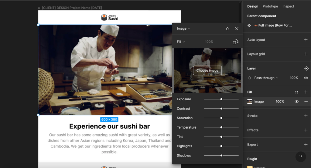
Images → In Figma, images are always placed inside a frame (the frame functions similar to a clipping mask in Adobe CC programs). To change the behavior of the image, go to Fill on the right-hand properties window and open the image properties.
Fill → Image will fill the container fully no matter how the frame size changes, and the image may appear cropped if the image proportions do not match the frame proportions.
Fit → As the frame changes size, the image will fill the frame without ever being cropped or partially hidden, even if this leaves some blank space inside the frame.
Crop → Crop the image to the exact size you need to fit the frame. This gives more control over how the image fills the frame as you can drag the corners of the image to control zoom and what area of the image is centered within the frame, just be careful not to stretch/distort the image while doing this. Note: you won’t permanently lose the cropped part of the image because you are only masking the image, not changing the size of the file itself.
Tile → Repeats the original images as necessary to fill the frame, and you can adjust the size of the tiles.
Typography → Figma comes preloaded with Google fonts. You can change the font family, sizes, line weight, line height, and content within the component under “Text” that appears when you have a text box selected.

Emailify automatically includes Google Font @import code in your HTML exports. A fallback web safe font (e.g. “Arial”, “Georgia” or “Courier”) will automatically be loaded instead for any email clients that don’t support custom web fonts.
Figma features to avoid in emails
There are some figma features that do not translate into HTML and therefore should not be used when designing emails:
If you want to achieve these looks ^ consistently, you will need to execute that in Photoshop as part of the image file itself.
Adding animated GIFs
There are a few different options for using GIFs in your email designs, each one works a bit differently, depending on how you’d like to incorporate the GIF into your design:
Using animated GIFs in “Image” layers
You can open a GIF file from your computer into any image frame by uploading the GIF into the Fill editing area while the image frame is selected. The advantage of this is that you can then add other Figma layers (text, images etc.) inside the image frame on top of your animated GIF, and those will also be included in the GIF that gets exported with your HTML email.
Using animated GIFs in “Hero” layers
If you need to use an animated GIF as a background image for an entire component/section while layering it behind live text or other images, you can open a GIF file from your computer into any Hero component’s Figma fill area. This will allow you to layer other elements over top while keeping them as completely separate elements from the background image/GIF when the HTML is exported.
Exporting Emails and File Hygiene
Exporting from Emailify to Dreamweaver
Once the design is approved, in the Export task the Design team should provide you with 3 links: The Figma Proof, the Emailify link, and the Google Drive folder. The Figma Proof is what the Client approved, so you can refer to it to know exactly what the final email should look like. The Emailify link is where we will be exporting from into Dreamweaver. And the Google Drive folder should have all of the image assets for the email.
To host the images, first we need a folder with all of the images downloaded to your computer. To get this folder, you can go to the Google Drive folder linked in the Export task, and the Designer should have uploaded all of the images there. If not, you can also click the Export HTML button in Emailify, and it will export a folder called img that has all of the image assets.
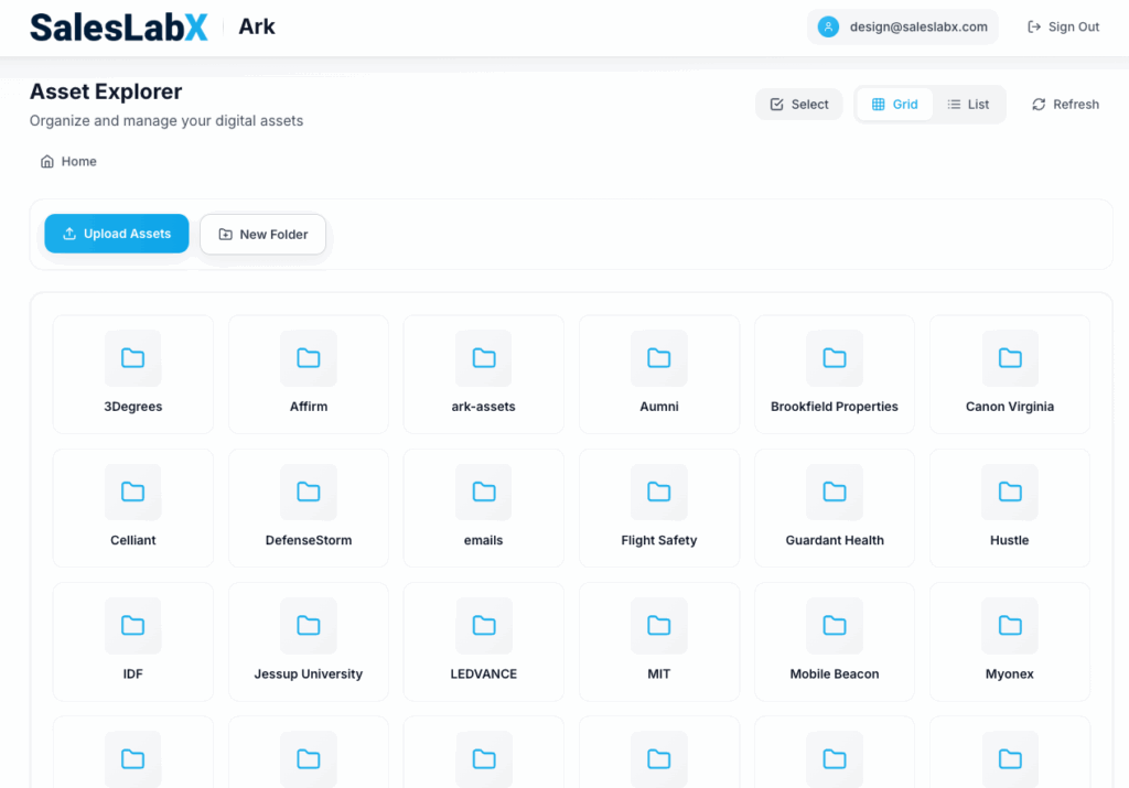
Next navigate to https://ark.slxbox.com/ which is our hosting service for all Email Images and Landing Page Files. Select the client you are working on from the list of folders, and drag in the folder you downloaded with all of the images.

Updating links
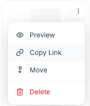
To update image and CTA links, have the Emailify builder open. Select the image that you would like to add the source link to. Once selected, click “HTML & Mobile Settings” at the top of the email builder. A panel will pop up with options to fill in the appropriate link from Asana, and you will also paste the image URL from Ark (click the Copy Link button on the image) in the the field “Override Image Src”. Do this for each image in the email. The alt text for each image can also be filled within this panel if needed.
Global Components
Global components are a Figma feature that lets us create modular frameworks customized to each client brand that we can use over and over again. Each client will have their own global templates containing multiple commonly reused components customized to fit their brand. For each client’s email template we will use the following naming convention: [CLIENT INITIALS] EMAIL GLOBAL TEMPLATE
Creating a Global Component
Start by highlighting the entire email, then right-click the border of the selected area. From the menu, choose “Main Component” and then click “Publish Selected Components”. This will open a dialog box that displays all the modules with checkboxes next to them – one of them will be the entire emails grouped as one module. Uncheck that one and leave the rest marked, then press the “Publish” button.
Where to find the Global Components to use in your email design
On the left side panel under assets, there is a book icon representing the “Library”. If you are using global components within your email, you will be able to see the elements on the left side panel under its designated Global components names.
If you would like to add a global component that has already been created, click the library icon and a panel will appear with the active global components.

Once you find the components that you would like to add to your email, toggle on the components you need for the email, then close the panel. When you close it out, you will see your newly added components in the left side panel. You can now drag the components you want to use in your email to the bottom of the frame to add them.

If you would like to remove the components from the loaded components panel, repeat the steps to add a component, and instead, toggle off the component.
Updating a Global Component in an existing Global Email Template
When there is a global component that needs an update, you will go to the global template that the component lives in to edit it.
After making the update, click the library icon on the left side panel, A blue dot will show up on the icon. A panel will show up that lists your global template. Press the “Publish Change” button next to the name of your template.

Updating a Global Component in a New Email Template
If you see the blue dot, that means there’s been an update to the “Library”, and you need to update the global component before proceeding with your design to make sure everything is up to date.
To update a global component, You click the library icon and within the panel next to Libraries, click “Updates” Under selection you will see the designated sections that need to be updated.
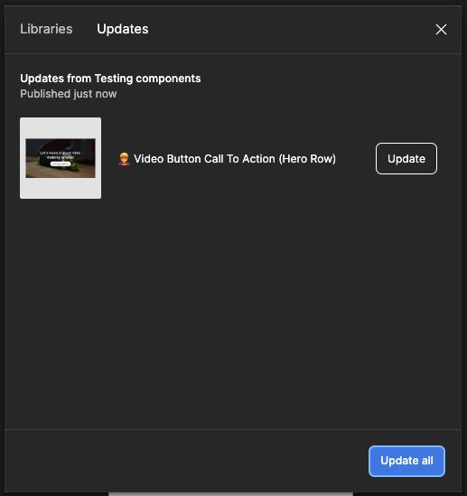
Select the Update button on the sections you would like updated, or if needed Update all. Once updated, the components will disappear from the panel and apply to your email.

Select the Update button on the sections you would like updated, or if needed Update all. Once updated, the components will disappear from the panel and apply to your email.
Figma Naming Conventions:
Email Templates for each Client: [CLIENT INITIALS] Email Global Template
Email Design Files: [CLIENT INITIALS] DESIGN Project Name [DATE]
You will use Dreamweaver frequently to manipulate code generated from Postcards or Webflow.
Here’s a general guide to Adobe Dreamweaver if you are unfamiliar.
Key Skills:
The design team uses XD to create landing page designs for developers to build. When they submit their designs you’ll receive their full XD file so you can see everything in and around their artboards, check settings used, and make adjustments if needed.
Here’s a General Guide to Adobe XD
What to expect from designers:
What you need to do:

In general Photoshop is the designer’s realm, but you may find that you need to adjust or optimize files provided by designers to ensure the asset will be as responsive and fast loading as possible.
Here’s a General Guide to Adobe Photoshop
Key Skills:
Again, Illustrator is primarily the designer’s realm, but you may find that you need to adjust or optimize files created in Illustrator by the designers.
Here’s a General Guide to Adobe Illustrator
Key Skills:
Some SLX Clients have a WordPress add-on where we manage their WordPress website for them. This is mostly handled by the design team but developer assistance is sometimes needed when things get complex.
What is WordPress?
At its core, WordPress is the simplest, most popular way to create your own website or blog. In fact, WordPress powers over 40.0% of all the websites on the Internet.
On a slightly more technical level, WordPress is an open-source content management system, which means that it allows anyone to use or modify the WordPress software for free without needing to know anything about programming. WordPress makes building a website accessible to anyone – even people who aren’t developers.
Here’s a great Skillshare class for WordPress beginners to help familiarize you with the tool.
What is Elementor?
The Elementor Website builder plugin allows WordPress users to create and edit websites by employing the drag and drop technique, with a built-in responsive mode. Elementor makes building and editing webpage designs so easy that our designers are able to handle it on their own with little to no coding skills… most of the time. You may be tagged in to assist for advanced configurations or to advise on structural strategy on occasion.
Tons of tutorials for the tool are available on Elementor Academy.
SLX WordPress Management Scope of Work (SOW)
For SLX to manage a WordPress site, we need the following:
Whats Included in the WordPress Management Plan:
What’s NOT included in our WordPress Management Plan:
What to expect with a new WordPress account:
In the event that there are complications while implementing these changes, we may need to extend the initial maintenance period to troubleshoot or to rebuild any pages that are not compatible with our updates (this is rare and usually only occurs if the site’s previous managers did a lot of custom coding).
Info coming soon.
Info coming soon.
Info coming soon.
Info coming soon.
Anchor links direct users to a specific section on your landing page. By clicking an anchor link, your visitor can jump to a certain part of your web page in a moment. The process saves time and keeps visitors on the landing page.
To create an anchor link: select the element you would like the link to jump to on the page. Go to the Advanced tab, and specify a CSS ID , such as FORM, then add “#ID-NAME” (#FORM) to the object you would like to hyperlink where you would normally put the destination URL. You can also link to specific sections of other pages by adding /#ID-NAME to the end of the url of the destination page.
Sometimes a client’s custom request can be solved with an Elementor Add On
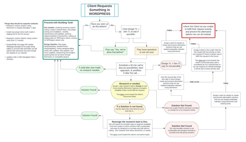
We also have this handy dandy flowchart for handling custom WordPress requests from clients:
More info coming soon!
(Pronounced “Par • daat” not “Par • doh”)
Pardot is Salesforce’s marketing automation tool and one of the main platforms we offer services for. Whether you’ve had experience with Pardot before or not, you’ll be learning a lot on an on-going basis. Much of what we do for clients in Pardot centers around marketing automation, lead generation, and design. Review the resources below to get started with a general overview of Pardot:
Internal Recordings
The below recordings are informally recorded SLX training videos on Pardot. We will be updating these in the near future with more formalized training videos, but for now, please review the following links to get a general overview of Pardot’s features:
Pardot Certification
While we have Pardot specialists on our team, we would love for Developers to also become experts! When you’re ready, we’ll help you schedule your certification and will pay for it too.
Here’s an In Depth Tutorial.

Looking over an email before taking it to Email On Acid:
How to test an email on EOA using “start testing”:
How to create an email temp on pardot and send test to Email On Acid:
Here’s a walkthrough of sending an email for review:
How to make an email editable:
IMPORTANT NOTE!
For now, to make a module movable and removable the Emailify code needs tweaking.
The closing and opening of a new module in the Emailify exported code is joint and will need separation. On top of that, a new wrapper div will need to be created in order to hold the module content including the MSO code.
The closing </td> </tr> </table> of the MSO code needs to be closed out with [End if] statement, then the main wrapper div will need to be closed, and a new wrapper div for the next module will need to be created. After that, a new [if mso] will need to be added above the mso table tag open. The the same process goes to every module on the email.
Here are before and after Examples, and here is an html file to reference for your convenience.
BEFORE
<!–[if mso | IE]>
</td></tr></table>
<table align=”center” border=”0″ cellpadding=”0″ cellspacing=”0″ class=”r-outlook -outlook pt-0-outlook pr-0-outlook pb-0-outlook pl-0-outlook -outlook” role=”none” style=”width:600px;” width=”600″><tr><td style=”line-height:0;font-size:0;mso-line-height-rule:exactly;”>
<![endif]–>
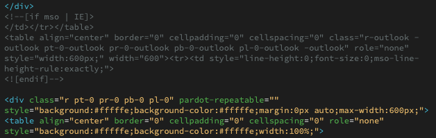
AFTER
<!–[if mso | IE]>
</td></tr></table>
<![endif]–>
</div>
<div pardot-repeatable=”” >
<!–[if mso | IE]>
<table align=”center” border=”0″ cellpadding=”0″ cellspacing=”0″ class=”r-outlook -outlook pt-0-outlook pr-0-outlook pb-0-outlook pl-0-outlook -outlook” role=”none” style=”width:600px;” width=”600″><tr><td style=”line-height:0;font-size:0;mso-line-height-rule:exactly;”>
<![endif]–>

Please see the SLX Developer Knowledge Base.
Email Sends are the #1 most important and most delicate task we do for our clients. Unlike landing pages and social media posts, they cannot be edited once they are sent. This is why it is CRUCIAL to make sure you have all the information you need and triple check your work before scheduling or sending an email. There are two types of emails in Pardot: List Emails and Email Templates. Email Templates are kept on file to be so they can be converted to List Emails and sent multiple times over and over. Email Templates can only be published, they can’t be sent without converting them to a List Email. List Emails can only be sent or saved as a draft- they cannot be published. Occasionally clients will change their mind about whether they need a list email or email template, and when this happens we can easily convert by copying the code from a list email draft and creating a new email template with that code, or if an email is a template and needs to be sent as a list email we can create a new list email and apply that template through Pardot’s normal list email creation workflow.
(We need to move this tutorial to SLX Cloud)
Creating a New Form:
Log in to the client’s Pardot and then Navigate to Marketing > Forms > New Form > to create a new form.

Initial Setup:
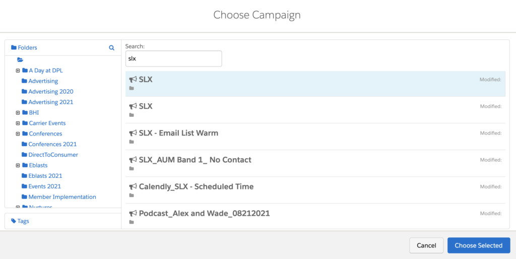
Use Naming Convention: SLX_Project-Name_Form. The Project Name should be a few words from your Asana task title. Skip choosing tags, folder, or tracker domain, and choose the campaign called “SLX” unless otherwise instructed in the task description. Click Next.

Configure Fields:
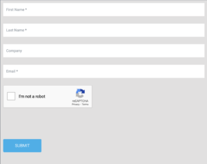
Add/Configure Fields as specified in the task instructions. To add a field, you will click + Add New Field and then in the resulting dialog box click the dropdown called Prospect Field. Select the field name specified in the task. If you do not see it, it could indicate that a custom field needs to be created (should be a separate subtask in Asana), or that a custom field that was created in Salesforce has not yet synced with Pardot. If this happens, reach out to your team lead and the AC to let them know. Once you select the prospect field, click “Load Default Data.” This populates the field type and prefilled values if applicable. Make sure the data format is either text (applies to 99% of fields including phone numbers) or email (for email fields only). You will notice a checkbox that says “Required” – only mark the field as required if the task instructions tell you to do so. Required fields will show a (r) next to the field name in the Form Wizard and an asterisk when viewing the final form as a user.


By default, fields a user has already completed on a different form will be hidden. If you do not want the form to do this (because it will change the height of the form and throw off your Landing Page design for example), go to the Advanced tab of the field editor dialog box, and check “Always Display even if previously completed.”

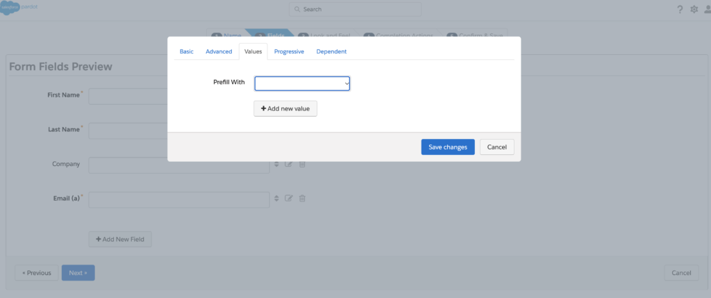
If the field you have created has prefilled values (such as a pick list, dropdown, or radio button field), you can view the options under the Values tab of the field editor dialog box.
In the Progressive tab, you can enable Progressive Profiling (only if instructed in the task description). This is a strategic way of gathering information from prospects gradually over multiple form submissions rather than overwhelming them with every question you’d like them to answer all at once.

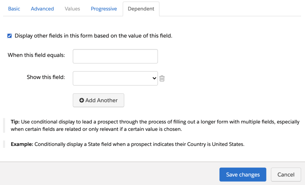
In the Dependent tab, you can enable Dependent Fields (only if instructed in the task description). This means that certain fields will only appear if a prospect answers a particular question a certain way. For example, if the prospect choses “United States” as their country, then a “State” field might appear with a drop down to select their state.
Look and Feel:
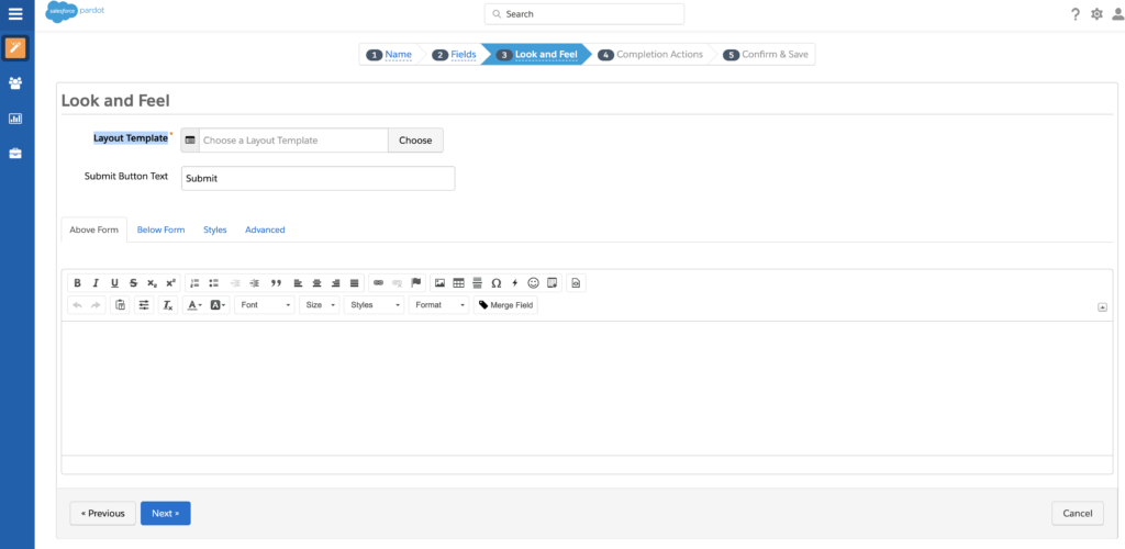
Once you have added all the fields in the order indicated in the task description and configured them appropriately, click next to proceed to the Look and Feel tab of the Form Wizard. Here you will choose a Layout Template. We’ll explain this in more detail in the next section, but essentially the layout template is the code that controls how the form looks. Usually, you’ll either select a layout template specified in the task, or if none is specified you’ll choose a generic or random one and we will create a new one later that’s modeled off the design proof for the page the form will be embedded in.
Enter Submit Button Text. This is what the button to submit the form will say. It could be “Get a Demo”, “Get Your Free Guide”, “Register Now”, etc. When in doubt, just use the word “Submit.”
Extra Features on Look and Feel:
Typically we ignore the Above Form, Below Form, Styles, and Advanced tabs in the Look and Feel tab. When specifically requested, the Kiosk mode, entry reset, and reCAPCHA bot features can be easily turned on by toggling the check boxes under the Advanced tab. Click Next to proceed to Completion Actions.

The Kiosk mode: A feature that once turned on, will not allow forms to cookie the submition information. This is usually being used at convetions, when a single station is being used to register many different prospects. This way whenever a new customer starting to fill out a form, the form is clear and not going to show previous filled out email address, first name, etc…
Entry reset: A feature that once turned on, will show a clickable “not you” line above the submit button that if clicked, it will reset the cookies on the form and it will clear any prefilled information on the form (for example, if you try to fill out a form on a friend’s computer, if they previously filled out the form, their information will be populated automatically. This feature will allow you to clear the form with a click of a button)
reCAPCHA bot: This is a very familiar feature. When trying to submit a form this feature will assure that automated bots made by spammers, will not be able to submit. It gives a simple task like entering the letters that you see, or choosing a specific squares of an image that contain specific elements (“click on the portion of images that contain bicycle, cars, traffic lights, etc…)

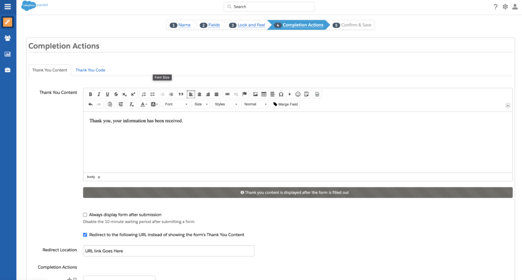
Thank You Content:
Under the Completion Actions tab, we always want to make sure there’s Thank You Content. This is the message that will appear after the user submits the form. If none is specified, just enter “Thank you, your information has been received.” Alternatively, we can skip this and check the box that says “Redirect to the following URL instead of showing the form’s Thank You Content” if the client would like users to be redirected to a thank you page instead of just seeing a thank you message appear in the box where the form was on the landing page.
Completion Actions:
The next step is to select Completion Actions. There are many options for completion actions as you will see in the dropdown. The most common ones are “Add to list” and “Send Email Template.” You would use Send Email Template if you wanted users to receive an autoresponder email confirming successful completion of the form. Note that you can only specifiy Email Templates, not list emails. If no completion actions are specified for the form, double check with your team lead and AC to make sure they didn’t forget, as a form with no completion actions is pretty rare. Once all completion actions are entered, click Next to proceed to the Confirm and Save tab.

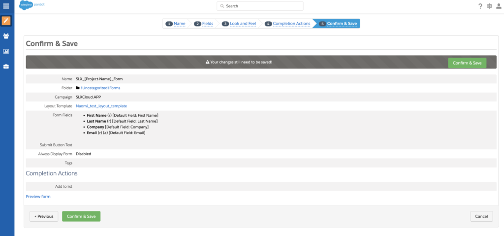
Confirm and Save:
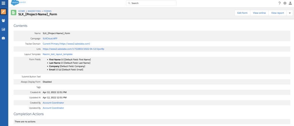
There’s nothing you need to do in the Confirm and Save tab except review your selections and make sure they match with the instructions provided to you. Click Confirm and Save, and you will be taken to the Pardot page for the form you’ve just created. From here, you can see all the details of the form listed out, click Edit form to make revisions, click View online to see how the form looks with the layout template you selected applied, or click View Report to review the form’s activity once it’s been placed on a live page. If you scroll down to where it says Usages, you can see a list of landing pages the form is being used on, and a list of prospects that have filled it out.
The appearance of Pardot forms is controlled by a Layout Template which contains CSS code and sometimes a little javacript. Fun fact: Layout Templates are used to style both Pardot Forms and Pardot Landing Pages. If a form is embedded in a landing page using an iframe (most common technique for us) then the form layout template will control the appearance of the form within the page, BUT if a form is inserted into a Landing Page the traditional Pardot way using %%content%% and the Landing Page Wizard, then the landing page layout template will control how the form looks and the form layout template will be ignored. We generally only need to worry about this when making Landing Pages editable for our clients, so more on that later.
Here are the main things you need to know to stylize a Pardot Form Layout Template:
To edit a form you can style in real time using the inspect tool in chrome and then once you’re happy with it copy the code for your desired styling into the pardot layout template.

You will need to ensure the form styling includes Cursor: pointer on the ‘Submit’ button.” Be aware of the standardized behavior of cursors so that you can apply the necessary styling for each form. If the cursor doesn’t follow the default behavior or match the task description, this will be considered a Dev error.
For help with styling forms, please see the SLX Developer Knowledge Base for code snippets and troubleshooting tips.
Here are the main things to know when importing a LP into Pardot:
See tutorial: https://saleslabx.com/pardot-landing-page-template/
(Need to migrate this to SLX Cloud instead of regular SLX website)
Preference Pages are a special animal in Pardot: a hybrid between a landing page and a form.
Sometimes if a campaign or custom field exists in SF but not in Pardot it’s simply because it needs to be synced.
Forcing a sync with Salesforce: To trigger a sync from SF to Pardot, create a new automation rule with the action “add to Salesforce Campaign” and a “Refresh Data” button will appear that can trigger the sync. You can now cancel the new automation rule.
Salesforce is one of the biggest customer relationship management (CRM) platforms in the world. This is the other main platform that we offer services for. Even if you’ve had experience with Salesforce before, there’s plenty to learn about the platform on an on-going basis as well.
Not all of our clients have Salesforce, but for those who do – their needs also vary widely. We also recommend checking out modules on Trailhead – Salesforce’s learning platform that offers a series of online tutorials, interactive assessments, and more. You can sign up for a free Trailhead account through your Google account. Read more about Trailhead here. Here are just a few suggested modules:
Salesforce Certification
While we have Salesforce specialists on our team, that doesn’t mean you can’t become one too! If you’re interested in getting Salesforce certified, we’ll pay for it.
Here is a Loom video for the MC Email build process:
https://www.loom.com/share/18ba96d7ef374888ab0416cea9633214Take the Pardot email code.
Remove Pardot repeatable <div>s.
Add AMPscript and set variable text if needed in the email content.
Update CTAs to be all caps.
Replace “Admission Counselor” with “Enrollment Coach”.
Upload all images to Marketing Cloud in the appropriate image folder.
Update the email with Marketing Cloud-hosted image URLs.
Update all links in the email according to the task description.
Ensure there are no orphan words in paragraph lines by using between the last two words.
Create a new email template using the Create button in the email templates folder.
Choose Create from Existing Template.
Navigate to the Empty tab and choose Blank Page.
Go to the Code View tab.
Copy the email code starting from the AMPscript, including the <head> tag and the opening <body> tag.
Include the preheader <div> as well.
Replace the existing <head> through the opening <body> tag in the Marketing Cloud template with the copied code.
Remove the preheader text content so that it can be populated through the Marketing Cloud Preheader widget.
In the email code, locate the main content <div> created by Emailify (usually directly under <body>).
Copy everything inside that <div>—from the first MSO conditional comment to the final closing MSO comment.
Paste this content below the opencounter <div> in the Marketing Cloud template.
Do not delete the rest of the code in the template—only insert your content under opencounter.
Delete the default header and footer <tr>s generated by Marketing Cloud.
Use the “Reference Content” widget from the left sidebar to drag in a footer block.
Choose the appropriate footer layout based on the email.
Save the template using a name that ends in _TEMPLATE for easy identification.
In the Email Messages folder, click Create → Email Message.
Choose “Template” → “Saved”, and select the template just created.
Name the email according to the Task Description.
Update the Subject Line and Preheader.
Go to the Preview and Test tab and confirm all sending info is correct.
Go to the Recipients tab (tube icon).
Click the “Test Data Extensions” tab.
Open the Data Extension folder dropdown (don’t click the folder name).
Click the SLX folder (this time click the text itself).
Choose SLX_EOA and send a test to Email on Acid.
Update the email template.
In the email message, go to the “Define Properties” tab.
Under the “Template Changed” notification, click “Update Email Now”.
Repeat the EOA test until the email renders correctly.
Send the email to the SLX_QA list.
Notify the QA team that the test email was sent.
If revisions are requested:
Repeat the update process via the template.
Reapply changes in the email message via “Update Email Now”.
After QA approval, send a final test to the SLX_POC list.
This internal Design process outlines how client tasks are assigned to our Creative Team, and how our various teams collaborate towards completing design tasks. Please review the following process in detail and continue to reference it as needed. Any updates to the process will also be updated on the page. If you need additional help or clarification, please reach out to your team lead.
We also have a condensed version of our process here if you just need a quick refresher without all the details.
Please reference the brand profile every time you start a new project for a client, because they are being continuously updated and consistency is key to strong branding.
Looking for common coding fixes, troubleshooting guides, or layout templates? Find them here.
Recommended Bookmarked Sites:
Recommended Chrome Plugins:
Not sure which AC is associated with which account(s) and which accounts have what plan? Check out the handy dandy Account Ownership spreadsheet below.
FAQs coming soon. For now, if you have any questions, please contact Stephanie Crane.
If you need assistance logging into our Client portals, please refer to the Client Login Cheat Sheet for detailed instructions on accessing each of our active clients’ accounts.
Last Updated: Feb 7, 2023
As we continue to improve this training manual to be as helpful and clear as possible, there will be ongoing updates. We always welcome feedback and suggestions on the current version. Thank you!